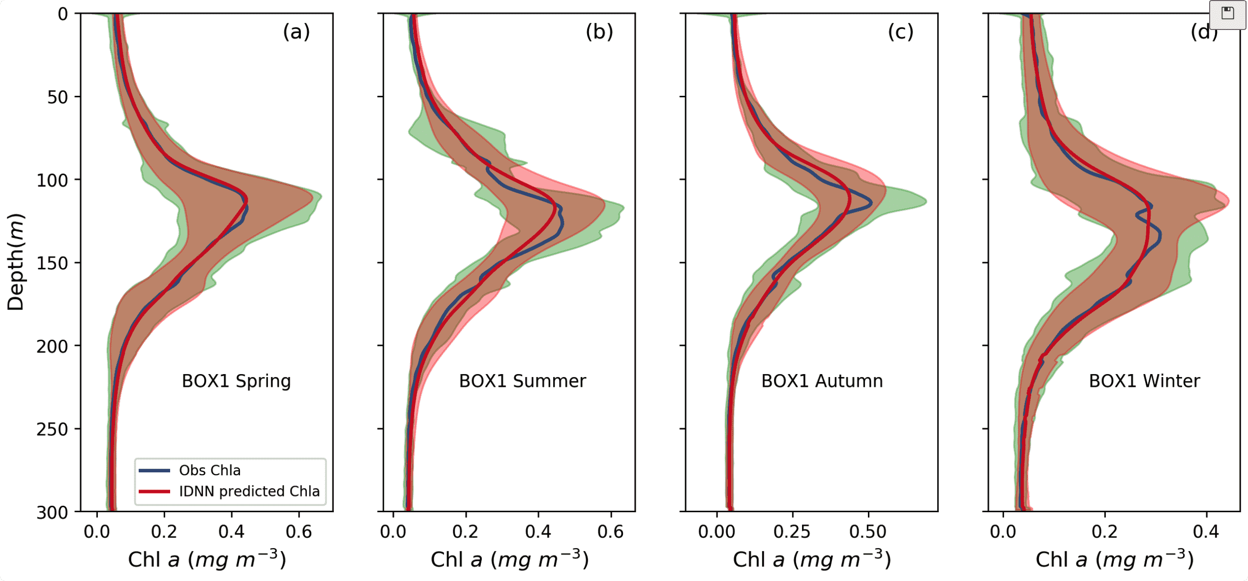
Matplotlib常用布局-代码仓库
行列组合
# 2 行 4 列
fig,ax = plt.subplots(2,4,figsize=(12,18),dpi=250,sharey=True,sharex=False)

# 第一行 第一列
ax[0][0].plot(spring_result.sub_chla,x,linewidth = '2.0',color = [56/255,89/255,137/255])
ax[0][0].plot(spring_result.model_pre,x,color = [210/255,32/255,39/255],linewidth = '2.0')

ax[0][0].fill_betweenx(x,spring_result.sub_chla-spring_std.sub_chla,
                 spring_result.sub_chla+spring_std.sub_chla,
                 color='g',
                 alpha=0.3)
ax[0][0].fill_betweenx(x,
                 spring_result.model_pre - spring_std.model_pre,
                 spring_result.model_pre + spring_std.model_pre,
                 color='r',
                 alpha=0.3)
# legend
ax[0][0].legend(['Obs Chla','IDNN predicted Chla'],loc= 'lower right',fontsize=8)

# 坐标系标签
ax[0][0].set_ylim([0,300])
ax[0][0].set_xlabel('Chl'+r'$\ a$'+r'$\ (mg\ m^{-3})$',Fontsize=12)
ax[0][0].set_ylabel('Depth'+r'$(m)$',Fontsize=12)
ax[0][0].invert_yaxis()  # 反转y坐标轴

# 文字标注
ax[0][0].text(0.4, 0.25, 'BOX1 Spring', fontsize=10,transform=ax[0][0].transAxes)
ax[0][0].text(0.8, 0.95, '(a)', fontsize=12,transform=ax[0][0].transAxes)
# ----------------------------------------------------------------------------------------

# ax[0][1].... 后面的图省略
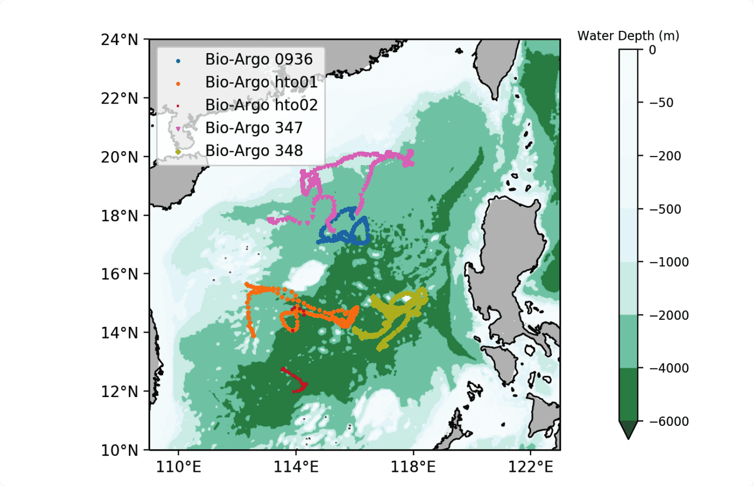
cartopy 地图
import cartopy.crs as ccrs
import cartopy.feature as cfeature
import matplotlib.pyplot as plt
from cartopy.mpl.ticker import LongitudeFormatter, LatitudeFormatter


styles = ['ro','ox','y+','gv','bD']
# cartopy的地图对象
proj = ccrs.PlateCarree(central_longitude=360)

# 画布 添加地图对象
fig = plt.figure(figsize=(10, 5), dpi=300) # 这里的figsize设置要注意图的宽高比例,图中字的大小跟这个数字大小有关
ax1 = fig.add_subplot(1, 1, 1, projection=proj)

# 10m 精度海岸线
ax1.add_feature(cfeature.COASTLINE.with_scale('10m'), lw=1)

# 画深度
fig1 = ax1.contourf(depth['lon'], depth['lat'], depth['Z'], levels=[-6000, -4000, -2000,  -1000, -500, -200, -50,0],
                    alpha=0.85, cmap='BuGn_r',extend='min')

# 数据
alldata = data1
fubiaohao = alldata['1floatid'].unique()  # 每个浮标号 不管剖面

# 循环画散点
for i in range(len(fubiaohao)):
    x = alldata[alldata['1floatid'].isin([fubiaohao[i]])]['Lon']
    y = alldata[alldata['1floatid'].isin([fubiaohao[i]])]['Lat']
    ax1.scatter(x, y, s=3,marker=styles[i][1],c=colors[i], label='Bio-Argo ' + str(fubiaohao[i]),)

# legend
plt.legend(loc='upper left')

# 坐标标签 经纬度格式化
ax1.set_xticks([110, 114, 118, 122, ], crs=ccrs.PlateCarree())
ax1.set_yticks([10,12,14,16, 18, 20, 22, 24], crs=ccrs.PlateCarree())
lon_formatter = LongitudeFormatter()
lat_formatter = LatitudeFormatter()
ax1.xaxis.set_major_formatter(lon_formatter)
ax1.yaxis.set_major_formatter(lat_formatter)
ax1.set_extent([109, 123,10, 24]) # 图片扩展最大的边缘

# 添加陆地 以及颜色
ax1.add_feature(cfeature.LAND, facecolor='0.75')

# colorbar
cb = plt.colorbar(fig1,fraction=0.035,shrink=0.95,pad=0.07)
cb.ax.tick_params(labelsize=8)
cb.ax.set_title('Water Depth (m)',fontsize=8)

# save
plt.savefig('../images/res2.svg',dpi=200)
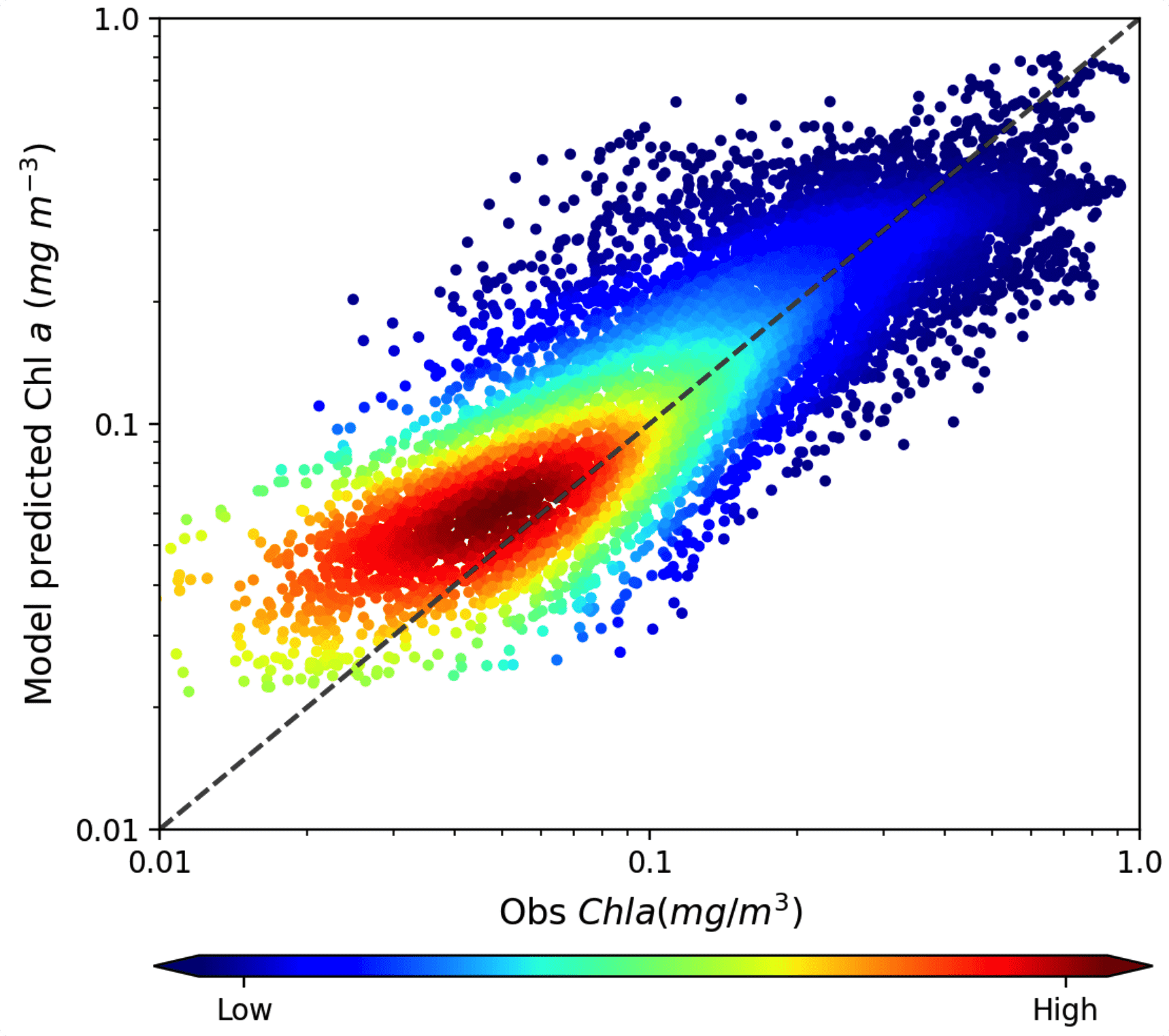
密度图
import matplotlib.pyplot as plt
from scipy.stats import gaussian_kde
label,predict = self._load_res() # 获取数据
fig,ax1 = plt.subplots(1,1,figsize=(6,5),dpi=200)

# 高维度数据拉平
y = predict.reshape(-1)
x= label.reshape(-1)

# 计算密度
xy = np.vstack([x,y])
z = gaussian_kde(xy)(xy)

# 画散点
k2 = ax1.scatter(x,y,c=z,cmap = 'jet',alpha = 1,s=8)

# 画对角线 下面某一句即可?
#ax1.plot((0, 1), (0, 1), transform=ax1.transAxes, ls='--',c='k', label="1:1 line")
diag_line, = ax1.plot(ax1.get_xlim(), ax1.get_ylim(), ls="--", c=".3")

# colorbar
position=fig.add_axes([0.12, -0.03, 0.79, 0.02]) #
cbar = plt.colorbar(k2,cax=position,orientation='horizontal',extend = 'both')#方向
cbar.set_ticks([2,38])
cbar.set_ticklabels(['Low','High'])

# 调整坐标系为log 和 上下限
ax1.set_yscale('log')
ax1.set_xscale('log')
ax1.set_xlim(0.01,1)
ax1.set_ylim(0.01,1)

# 标题
# ax1.set_title('(b) BOX2 Test Set',Fontsize=8)

# 坐标系label
ax1.set_ylabel('Model predicted '+'Chl'+r'$\ a$'+r'$\ (mg\ m^{-3})$',Fontsize=12)
ax1.set_xlabel(r'Obs'+r' $Chla(mg/m^3)$',Fontsize=12)
ax1.set_xticks([0.01,0.1,1])
ax1.set_xticklabels(['0.01','0.1','1.0'])
ax1.set_yticks([0.01,0.1,1])
ax1.set_yticklabels(['0.01','0.1','1.0'])
# 标注
# ax1.text(0.05, 0.85, r'$(b)\ BOX2$', fontsize=11,transform=ax1.transAxes)

# 保存
plt.savefig('scatter.png',bbox_inches='tight')
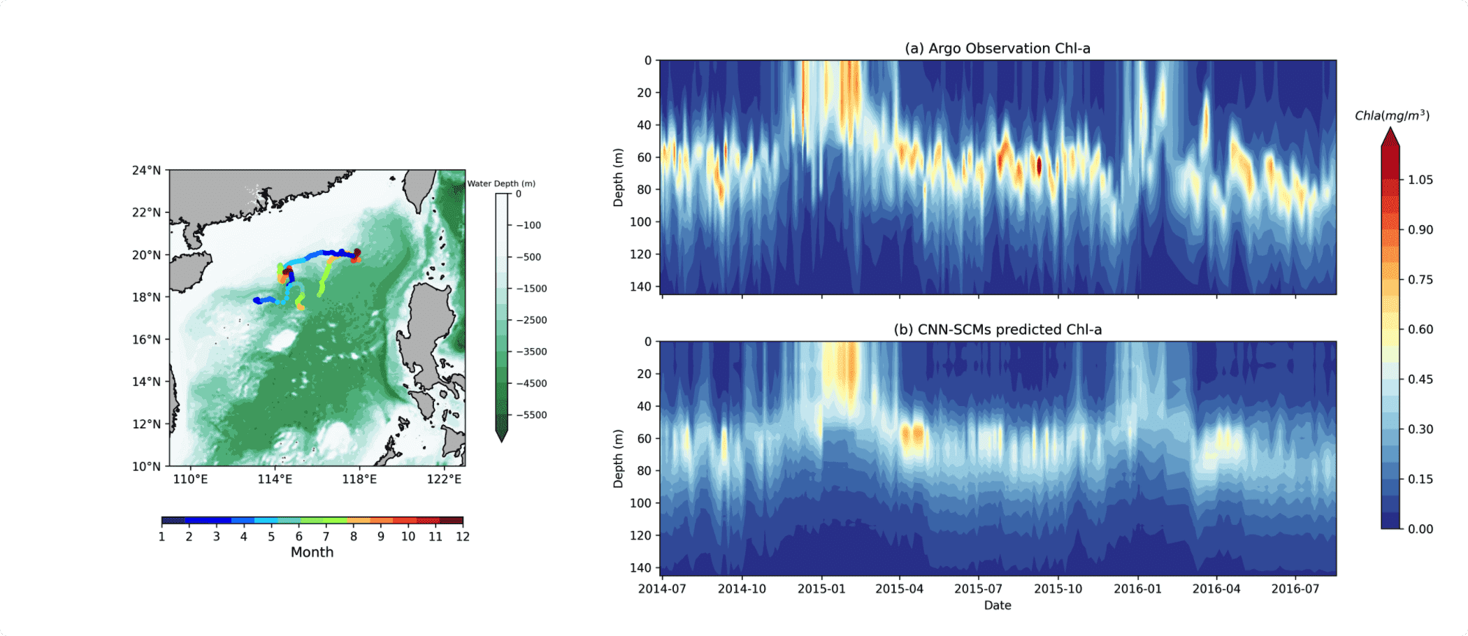
不等比例分割
from matplotlib import gridspec
# 数据
label,predict,time = self.loadData()
times = pd.to_datetime(time)

# 画布
fig = plt.figure(figsize=(18,8),dpi=300)

# 大布局 一行两列。比例 1:2 的占比 中间间隔 0.3
gs0 = gridspec.GridSpec(1, 2,width_ratios=[1, 2],wspace=0.3)

# 第一个分坐标系 从gs0[0]分出来,1*1 只画一张图
gs00 = gridspec.GridSpecFromSubplotSpec(1, 1, subplot_spec=gs0[0]) # 画地图浮标

# 画 第一张图。这里为了简洁 封装在了另一个方法里
fig = self.showFloatMap(fig,gs00[0,0])


# 从gs0[1]里面分出第二列,然后将其分为2行一列
gs01 = gridspec.GridSpecFromSubplotSpec(2, 1, subplot_spec=gs0[1]) # 两个对比
# gs01.update(left=0.55, right=0.98, hspace=0.55)

# 两行一列 分别赋给新的坐标系变量
ax1 = fig.add_subplot(gs01[1,0])
ax0 = fig.add_subplot(gs01[0,0],sharex=ax1)
plt.setp(ax0.get_xticklabels(), visible=False)  # 让ax0的x坐标标签隐藏

# 画 两个 contour图 level一样。才能保证统一了colorbar
lev = np.arange(0,0.7,0.05)
cmap = "RdYlBu_r"
extend = "max"
fig1 = ax0.contourf(times,self.depth,label.T,levels=lev,cmap = cmap,extend=extend)
ax1.contourf(times,self.depth,predict.T,levels=lev,cmap = cmap,extend=extend)

# 反转y坐标系
ax0.invert_yaxis()

# 设置坐标轴和标题信息
ax0.set_ylabel("Depth (m)")
ax0.set_title("(a) Argo Observation Chl-a")
ax1.set_title("(b) CNN-SCMs predicted Chl-a")
ax1.set_ylabel("Depth (m)")
ax1.set_xlabel("Date")
ax1.invert_yaxis()


# 设置colorbar。这是最灵活 最好的放置colorbar 方式
l = 0.93
b = 0.18
w = 0.012
h = 0.6
#对应 l,b,w,h;设置colorbar位置;
rect = [l,b,w,h]
position=fig.add_axes(rect)
cbar = fig.colorbar(fig1,cax=position,extend = 'max')#方向
cbar.ax.set_title(r' $Chla(mg/m^3)$',fontsize=10)

# 保存
plt.savefig('/data/Chenjq/LunWenCode/Model_OISST/show/{}.png'.format(self.floatid))
最灵活的colorbar设置
l = 0.93
b = 0.18
w = 0.012
h = 0.6
#对应 l,b,w,h;设置colorbar位置;左边 下边 宽 高
rect = [l,b,w,h]
position=fig.add_axes(rect)
cbar = fig.colorbar(fig1,cax=position,extend = 'max')#方向
自由获取cmap
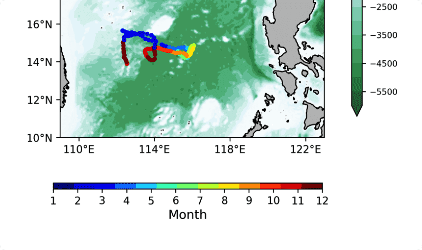
  cmap_month = plt.get_cmap('jet', 13)
  fig2 = ax1.scatter(x, y, s=10,marker='o',c=cmap_month(t),cmap="jet") # 要对12个月给出一个colorbar

  # Normalizer
  norm = matplotlib.colors.Normalize(vmin=1, vmax=12)

  # creating ScalarMappable
  sm = plt.cm.ScalarMappable(cmap=cmap_month, norm=norm)
  sm.set_array([])

  # colorbar
  l = 0.12
  b = 0.188
  w = 0.20
  h = 0.01
  #对应 l,b,w,h;设置colorbar位置;
  rect = [l,b,w,h]
  position=fig.add_axes(rect)

  cb =plt.colorbar(sm,cax=position,ticks=np.arange(1, 13, 1),fraction=0.027, orientation='horizontal')
  cb.ax.set_title('Month', y=-6.01)